Daniel Holmes
University of Teesside : BA Graphic Design
For
sales, commissions and to send comments to the artist click
here
|
|
|
|
|
|
|
|
|
|
|
|
|
|
|
|
|


Daniel Holmes
Artist Statement
Being able to adapt to a range of medium is an integral component of a modern designer, an element I attempt to make evident within myself. I try and emphasize through my work the importance of embracing new techniques whilst simultaneously recognizing retrospective methods. I believe the ability to identify a simple solution is essential, clarity of representation is paramount, innovation and purpose must be a successful miscegenation in order to compose a communicative and prominent piece.
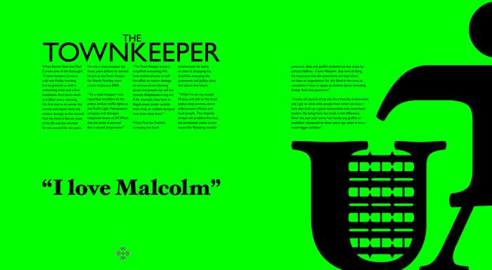
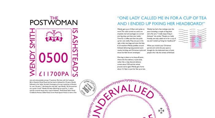
City
Types:
This brief set by ISTD (The International Society of Typographic Designers)
required me to look at examples of letter forms in a typical city centre
and to integrate words and images to make a personal statement in a typographic
magazine that was about to be launched. Instead of focusing on type literally
I conducted an inquiry in to the types of people within the city. Rather
than focus on professional people that operate within that sphere, I examined
the persons that undertook less high profile tasks and viewed how they
were integral to the city. The primary image is of the magazine cover,
the pattern was constructed exclusively of type that was juxtaposed to
form various figures that conveyed human form. The remaining three images
are of double page spreads taken from the feature article ‘City
Types’.
Ford
Capri:
A fictitious campaign to promote the unveiling of the ‘New’
Ford Capri at the British Motor Show. As the visuals were exclusive to
the Motor Show, design was purely typographically based. The previous
vehicle had a stigma attached, so I decided to highlight the feelings
of the people who had an affinity with the car. These were portrayed in
a lonely hearts format, the typography followed a grid derived from road
maps, highlighting the cars journey. The image is of a proposed billboard
poster for the campaign.
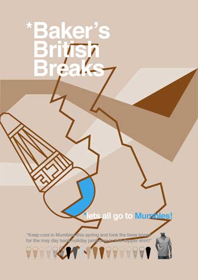
Si’tha:
To create a fictional design consultants and form its ethos and identity.
Si’tha is a company that challenges the idea that ‘good’
design is exclusive to London. It also begs the question, what is good
design, what is contemporary, what is cutting edge and who and what defines
these? Based in the North, the identity revolves around Northern dialects
and sayings. The image is a spread taken from an accompanying experimental
promotional publication.
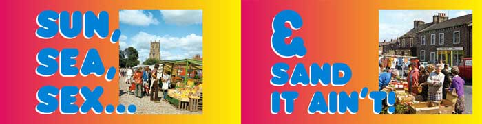
Ted
Baker:
The international fashion label was looking for a new marketing campaign.
With Ted Baker having a patriotic British identity I chose to use the
British Isles as the basis for my investigation. The theme of the piece
focused on British coach holidays and the various seaside resorts that
they tour. I felt that this retrospective look at a bygone Britain with
a kitsch acknowledgement to the tour buses encompassed the humorous undertones
synonymous with the Baker brand. The image is one of a series of four
posters.
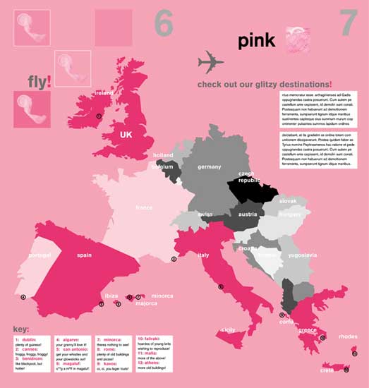
Pink:
Involved creating an identity and manifesto for a fictitious budget airline.
The name pink was chosen, paying homage to the colour many ‘Brits’
turn after sun contact abroad. The logo comprised two components, the
typeface, which was always to appear in black and an image from a gathered
collection. The images all relate to objects that make up the indulgences
of ‘a Great British holiday’ abroad. The image is taken from
a double page spread from the manifesto that showcases the pink destinations.
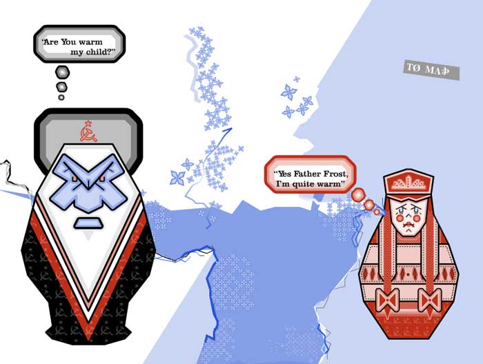
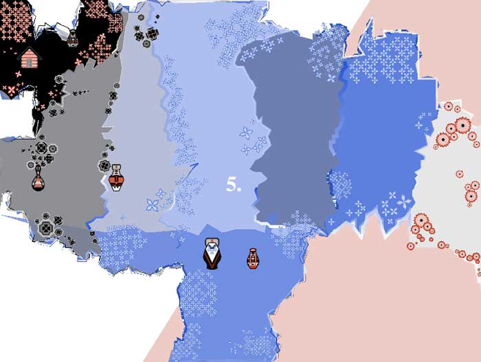
Father
Frost:
Is an interactive story book for young adults with learning difficulties.
The Russian folk tale ‘Father Frost’ was chosen. The focus
was on instilling fairy tale values while creating a visual style that
appealed to an older audience. The visuals centered around the traditional
Russian doll theme. Interaction was based on translating the Russian Cyrillic
typeface in order to be presented with the English. The two images represent
a scene from the tale and the map interface used to navigate the piece.
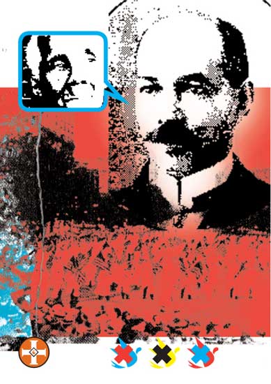
To
Kill A Mockingbird:
Following the BBC’s Big Read campaign I was asked to chose a book
from the short list to illustrate. The book in question was Harper Lee’s
‘To Kill A Mockingbird’. The book centres around racial conflict
in America in the early 20th century. I decided to draw parallels with
racial friction then and today by sourcing imagery that encapsulated this
from both eras. The image is part of a set, the one featured tackles racial
prejudice in the early 20th century.