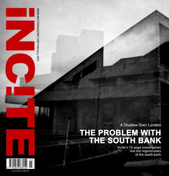
Incite 1
Incite2

NovaExpress1

NovaExpress2
NovaExpress3
NovaExpress4
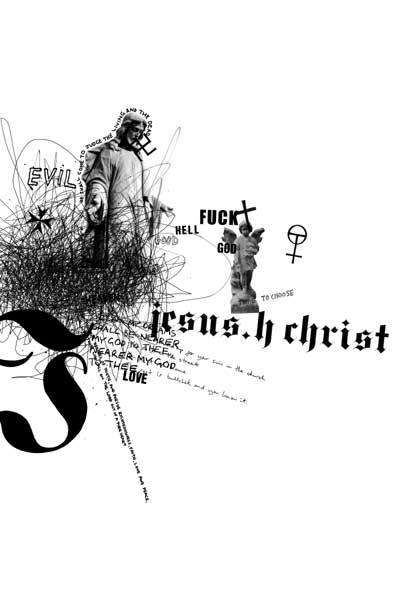
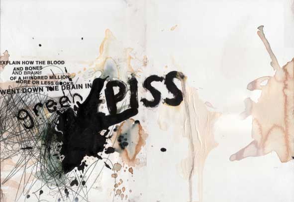
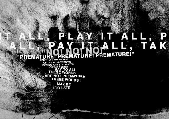
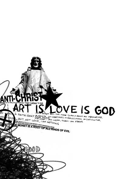
Religion1

Religion2
Religion3
KRISTIAN GODDARD Nottingham Trent University: Graphic Design For
sales, commissions and to send comments to the artist click
here |
|
|
Incite2 |
||
|
|
|
||
|
NovaExpress1 |
NovaExpress2 |
||
|
|
|
||
|
NovaExpress3 |
NovaExpress4 |
||
|
|
|||
|
Religion1 |
Religion2 |
||
|
Religion3 |
|
||
|
Artist Statement: I've just
graduated from the Nottingham Trent University where i've been studying
graphic design for the last At the moment i'm trying to find interesting projects to get involved in to use my design skills. I'm particularly interested in working in the music/film industry. I feel comfortable working at different ends of the design spectrum. Either producing tight/clean layouts or more expressive mark making techniques, depending on the project or my mood!! If anyone wants to e-mail me they can do so at kristian@kristiangoddard.com. Hope you like the work. RELIGION This project was an attempt, by me, to come to terms with my own spirituality and reflect the conflict that exists in most people's view of religion and the church. By using conflicting imagery and religious iconography, I was able to interpret these emotions in a graphic way. The pieces stand as examples of graphic art rather than graphic design and come from a completely neutral standpoint. I thought that it was important to take this stance although some people have been offended by the project's use of religious icons in this context. NOVA EXPRESS BOOK ILLUSTRATIONS I used stark
black and white marks to illustrate William Burroughs dystopian view of
modern America, 'Nova Express'. The whole project was based around the
notion of 'chance' and I used materials such as indian ink, paint and
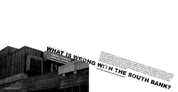
INCITE MAGAZINE LAYOUTS The article discusses the regeneration of the South Bank in London and the South Bank Centre's role within it. I wanted to make a statement with my work and this project illustrates an article that I wrote about the subject. I reduced
the colour of the photographs and printed the layouts in monochrome in
an attempt to reflect the weather-stained buildings and mis-management
of the SBC. I also researched architectural grid structure The South Bank Centre remains one of my favourite areas in London and this project was a chance for me to celebrate the area and spread awareness of Government plans to knock down the complex. Nottingham Trent University: Graphic Design
|
|
|
||||