Web
Design
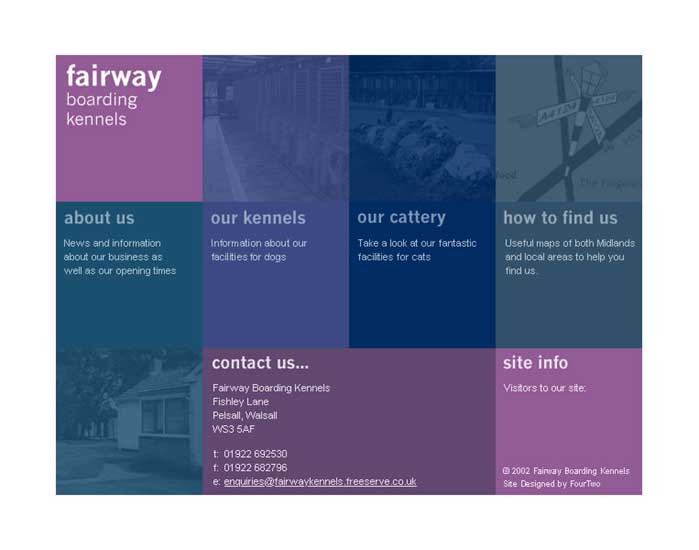
www.fairwaykennels.co.uk
web_fairwaykennels.jpg
This was one of my first websites for my parents business, and has seen
its design updated and improved as I have learnt more about designing
for the web. A simple site, the front page directs customers to the four
different areas of content.
www.coniston-house-kennels.co.uk
web_conistonhouse.jpg
Another website for a local kennels, this site featured an illustration
of the owners house which is the building customers are first likely to
see as they look for the business on the A5.
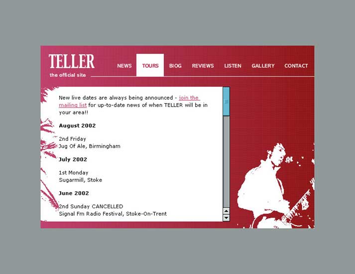
www.telleronline.co.uk
web_telleronline.jpg
This site has a unique design, one that emphasis the rockier aspect of
TELLER, and uses a large colour palette across the site to reflect the
bands colourful live performances.
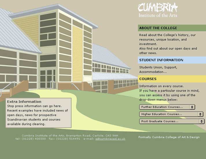
www.cumbria.ac.uk
(Proposal)
web_cumbria.jpg
This was a site proposal for my college at a time when it was undergoing
a massive investment programme to become Cumbria Institute of the Arts.
This site proposal made the newly extended Brampton Road campus a main
feature on the home page, and continued its themes throughout the site.
Moving Image
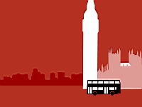
London’s getting smaller
movingimage_london.swf
This was completed as my entry for the 2002 D&AD Student Awards (advertising
- silent movie brief). Using simple shapes and bright colours, I created
a 30-second silent movie that attempted to join-up seven different forms
of transport found in London in a continuous flowing manner.
Having experienced the regions transport for myself, I developed a concept
based on the deception that London seems to get smaller. Using recognisable
landmarks, and decreasing their size as a mode of transport passed, attached
the location to the message. Using colours strongly linked to each mode
of transport as well as the use of familiar symbols - especially that
of two locking o’s ‘interchange’ symbol, further identified
Transport for London’s role.
Typography
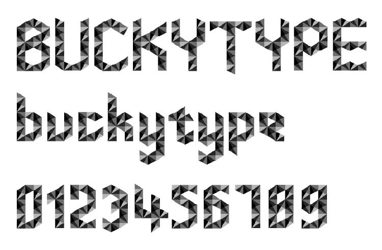
Buckytype
type_buckytype.gif
Having chosen Buckminster Fuller (the designer of geodesic domes) from
a list of 21 3D designers, I arrived at the design of ‘Buckytype’
by taking a pattern from the structure of one such dome which was of interlocking
triangles. This was then used as a sort of 'matrix' from which every character
could be taken.
Editorial Design
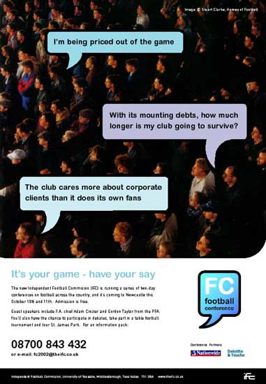
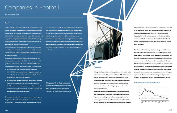
FC - Football Conference
editorial_fcinside.jpg
editorial_fcadvert.jpg
Final major project - self-directed. I designed a brief based around the
concept of the newly formed IFC (independent football commission) holding
a series of two day conferences that examined the state of English League
Football at the beginning of the 21st century. These would tackle the
issues of commercialism in the sport, in a way that was both accessible
and appealing to all audiences involved and would be held in cities across
the country so that local as well as national issues could be discussed.
To accompany this conference, the IFC was to commission a visual essay
that assessed the growing effect of commercialism.
The task was split into two parts, effectively asking myself to create
all graphic material to support the series of conferences. The first part
was that of promotional literature such as posters, invites and other
publicity, and the second part being that of the visual essay (called
FCplc, was designed to show the divide between football and business yet
bring them together) - the centre piece of my outcome.
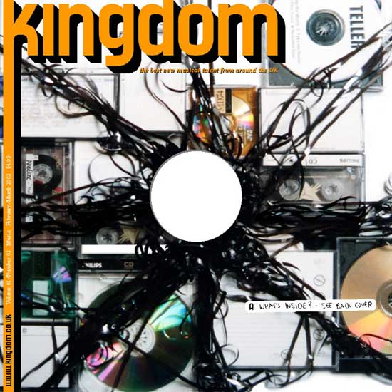
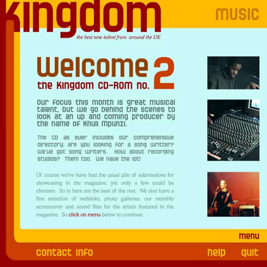
Kingdom
Magazine
editorial_kingdom1.jpg
editorial_kingdom2.jpg
‘Kingdom’ was to be a monthly magazine that concentrated on
the different cultures and lifestyles found in the four corners of the
United Kingdom, including: music, fashion, design, art, comedy and film.
The magazine concentrates on the activity of emerging talent, as well
as those who have already achieved success.
Each issue would have two features centred on two different parts of the
UK; one feature is editorially based inside the magazine, whilst the second
is in the form of an interactive element on the included CD.