Ross Green
Kent Institute of Art and Design BA hons Visual Communication - Graphic
Design
For sales, commissions and to send comments to the artist click
here
|
|
|
|
|
|
|
|
|
|
|
|
|
|
|
Ross Green
Kent Institute of Art and Design BA hons Visual Communication - Graphic
Design
|
||||||||||
| ||||||||||
|
Artist Statement: I aim to create, not just reproduce. As a creative I feel that you should always push concepts to the extreme. My main focus is to keep an open mind, design will never move forward unless new possibilities are explored. The gallery displays an insight into a selection of my main projects. The images shown are only parts of larger projects. All design excites me so I like incorporate a range of processes, keeping my work varied with the aim to experiment within other mediums.
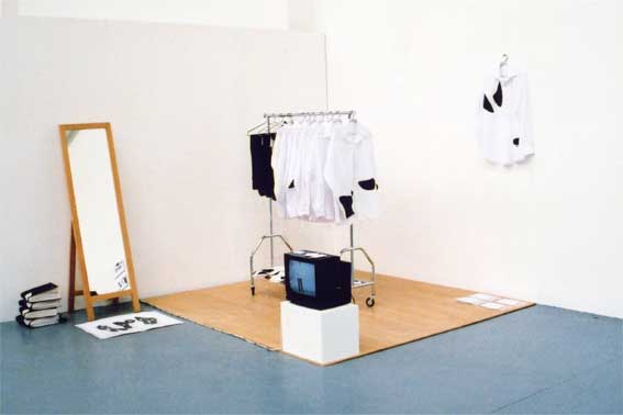
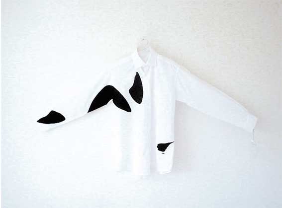
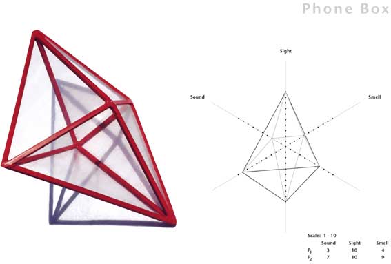
1&2 > The foundation for this project relies on anticipation. Rather than recreate areas of this subject, this concept aims to use it as a tool of prediction. Body Language accounts for 67% of our communication, but is very rarely considered in the conscious. The heart of this project consists of a range of 9 shirts and 4 trousers which recreate specific body postures when worn. Displayed as an installation, this project consists of clothing, tags, 4 interactive seat covers, interactive foot plots, a wall chart, an instruction dvd, tip cards and photographs.
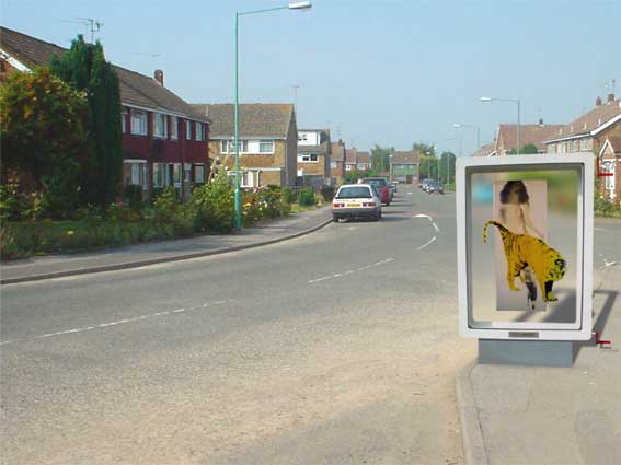
The purpose of this project is to hand the creative decision making back to the user. They are presented with the basic make up of graphic design. The images have been selected to work with each other while expressing completely different messages, allowing people to have a say in through a controlled form of graffiti.
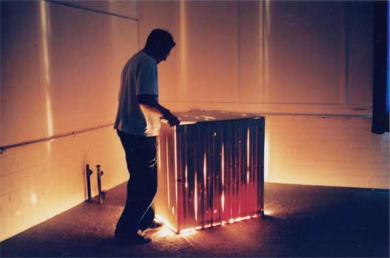
The concept is based on the attraction of a moth to a light bulb. Cracks have been fabricated in the sides of the box which entice the viewer through intrigue with the alluring properties of light. A fractionally smaller box was made, covered in felt and placed inside the main box. A push to make switch was fitted inside of the lid to turn the lights out when the lid was lifted. When the viewer lifts the lid they are faced with a dark and empty box.
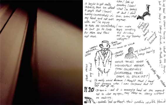
I decided to produce a documentation of the deterioration / migration of mental state. I was isolated in a room with no stimulation (apart from a camera and sketch pad) for 72 hours. During this time I did not sleep, only ate mars bars and drank coke (to produce highs and lows through sugar intake). Two photos were taken every 30 minutes, one of whatever was in my head, and the other was a portrait of my physical deterioration.
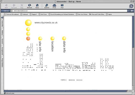
The brief for this project was to produce a web site based on any aspect of a city. I consider the rush of being in a crowd to be a key element in the identification of a city. This web site represents the crowd densities of Oxford Street, London, at various times of the day. On the home page each person is represented by a dot, all independently moving (to a scale density scale of 1-10).
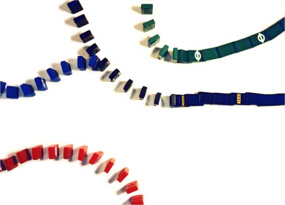
Each mode of transport was represented by a colour coded domino. The domino's were set out to map and denote the nature of each mode of transport, while highlighting the ease and fluidity of connections. This piece of work was published and credited in the 2002 D&AD Student Awards Annual.
Kent Institute of Art and Design BA hons Visual Communication - Graphic
Design
|
| |
||||