| Artist
Statement:
The first is a brand identity for the Surrey Institute Students Union
in Farnham. in my final year through 3 projects, i developed a new brand
which reflected the students at the Institute and also the Union. the
previous brand was outdated and did not represent the students at all.
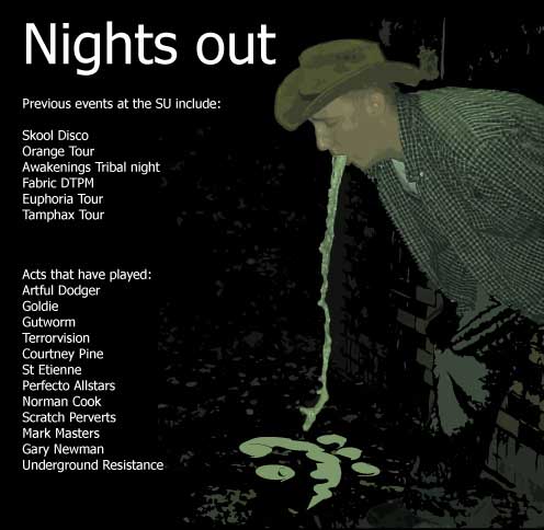
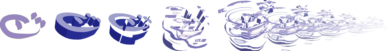
my brand consisted of 4 abstract symbols representing an eye, a hand,
a mouth and an ear. these were influenced by mayan, incan, egyptian and
celtic pictograms. the logos had to be multi applicable to certain aspects
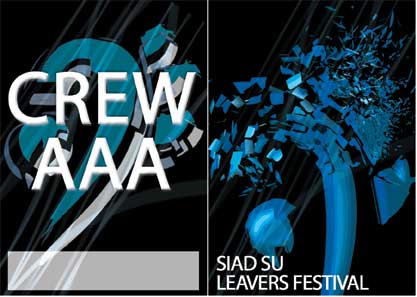
of the SU. indeed, they have already been put into practice with the ear
logo being chosen for the SU Leavers Festival this year (see crew pass
picture) and they have also been made into gobos for the SU lighting rig
(gobos are small metal discs that fit into the lights between the bulb
and the lense to create patterns).
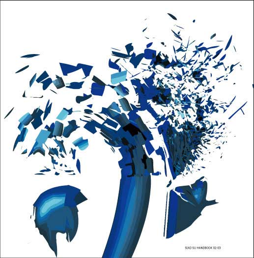
Over the course of the year, i developed the logos to become even more
abstract to fit into my final project which concerned transparency between
the Institute, the students and the SU. this culminated in a design for
an introductory booklet created by the SU which is meant to increase transparency
of the Institutes hierarchical system and also to introduce new students
to both staff of the Institute and the SU. this projected cemented the
brand identity more as it aquired a stronger style by the shattering of
the logos and also of the implimentation of hiding the logos into the
booklet pages.
The 3rd project is labels for a 2nd year student film project. these labels
were used with the costumes when they were exhibited as part of the film
showing. the film itself was shot around guilford and waterloo station
and features my flatmate wondering around in different costumes and observing
peoples reactions to his behavior. the film was shot on DV using 3 ways
split screens.
Ed
Clews
Surrey Institute of Art and Design, Packaging Design.
For
sales, commissions and to send comments to the artist.
|
| |
|